Academic IELTS Writing Task 1 Preparation (Part 2)
- Details
- Last Updated: Saturday, 09 March 2024 12:58
- Written by IELTS Mentor
- Hits: 114080
IELTS Writing Task 1 (Academic)
Practice 1:
» You should spend about 20 minutes on this task.
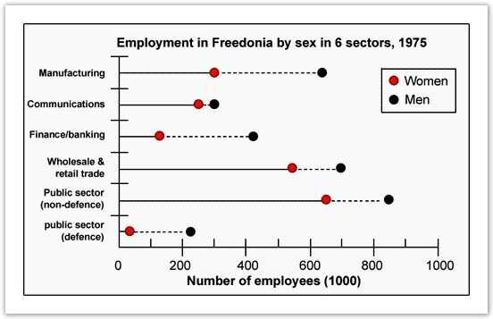
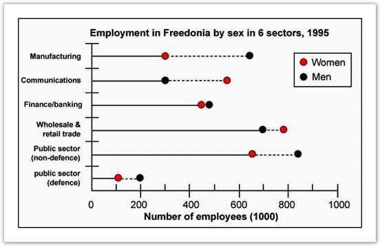
The graphs below show the numbers of male and female workers in 1975 and 1995 in several employment sectors of the republic of Freedonia.
Write a report for a university teacher describing the information shown.
» You should write at least 150 words.


First Step- Analyse:
Two line graphs given in the question. These graphs should be described by comparing/ contrasting main features and should be presented as a report to a University Lecturer.
Second Step- Collecting data/information:
a) Time: First graph is for 1975 and the second one is for the year 1995.
b) Theme: Comparison of men and women workers in 6 Employment sectors.
c) Place and Position: Freedonia.
d) Main Point: Comparison of men and women employees in respect to the job sectors.
e) General Trend: Initially in 1975, Men employees occupied most of the jobs in all sectors.
f) Effects & Result: The number of women employees increased significantly, especially in communication sectors over the 20 years period.
g) Conclusion/ Summary: Conclusion should be a summary of theme, general trend, and result. Sometimes you do not need to write the conclusion part. Keep in mind that graph writing conclusion is not same as writing the conclusion for an essay.
Third Step- Report Planning:
A) Writing Introduction:
The provided graphs represent information about the male and female workers of Freedonia in six different sectors in 1975 and 1995.
B) Writing General Trend:
As is observed from the two given graphs, the number of male employees was larger in all sectors of employment than that of women but after 20 years this discrimination had plummeted, in particular, in banking & finance sector and surprisingly more women were employed in communication sector in 1995 than their counterpart -men.
C) Writing Detailed Description:
According to the illustration, almost 600 men out of the thousand workers were employed in manufacturing jobs in 1975 and that was almost twice than the number of women employed in the same sector. After 20 years in 1995, the number of male workers in this sector increased to around 700/thousand but the number of women workers remained almost the same as it was in 1975. Again, male workers in banking, wholesale & retail trade, defense, public sectors were significantly larger in number than female workers in 1975. The highest number of workers, both the men and women, worked in public sectors in 1975. In this year in public sectors, almost 80 per thousand were men and 650 per thousand were female, which was larger in number than any other sectors. Job sectors like defense were mostly occupied by men whereas women were very small in number in this sector. In the year 1975, the smallest gap between the number of male and female workers could be observed in the communication sector. After 20 years, in 1995 the scenario changed remarkably. In this year female went ahead of men in communication and trade (wholesale & trade) sectors. Also the different of male and female employees in banking and finance became ignorable. On the other hand, the number of male employees had declined in defense and the opposite is true for women. The job condition in manufacturing sectors remained almost the same as it was 20 years earlier.
D) Describing the results:
Not necessary as it has already been described in detail description.
E) Writing the summary/ conclusion:
In summary, it can be clearly observed from the given graphs that, female participation in different job sectors had significantly improved and in some sectors, they went ahead of men.
Tips 1: Many teachers will tell you not to write any conclusion or summary in your graph answer. Here is what we think-
» Do not write a separate conclusion or summary if you have already described the general trends clearly in the introduction part and have already written more than 150 words.
» In case you find that you are yet to write 150 words and have something to say about the overall graph, go for the conclusion/ summary part.
Tips 2: You should use as many transitional words as appropriate to make the writing coherent. Do not copy the sentences from the given question. You are expected to write a summary, so you should never write down all the facts and figures presented in the graph. Never write less than 150 words.
IELTS Writing Task 1 (Academic )
Practice 2:
» You should spend about 20 minutes on this task.
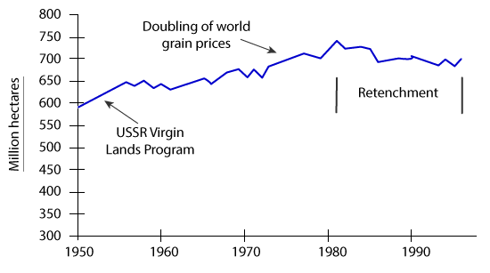
The graph below shows the area of land from which grain was harvested.
Write a report for a university lecturer describing the information in the graph.
Summarise the information by selecting and reporting the main features, and make comparisons where relevant.
» You should write at least 150 words.
World grain harvested area, 1950 – 96

First Step- Analyse :
The given presentation is a line graph. Here 'X' axis represents the time and 'Y' axis represents the area in million hectares where grain was harvested. The question is asking to summarise the main features and to make comparisons where relevant.
Second Step- Collecting data/ information:
a) Time: Past (1950 to 1996).
b) Theme: Total land in million of hectares where grains were harvested.
c) Place and Position: All around the world.
d) Main Point: World grain harvested area.
e) General Trend: Amount of land increased from1950 to 1980 and then this amount decreased.
f) Effects & Result: Virgin land program, Doubling the price of grain, Retrenchment.
g) Conclusion: Not necessary.
Third Step- Report Planning:
A) Writing Introduction:
The given line graph shows the total grain harvested area around the world in million of hectares from 1950 to 1996 and the reasons why the amount changed. Here the 'X' axis represents time and the 'Y' axis shows the land area in million of hectares.
B) Writing General Trend:
As is observed from the graphs, total grain harvested area increased until 1980, at which point there was a reduction due to retrenchment.
C) Writing Detailed Description:
According to the given illustration,
D) Describing the results
Not necessary as it has already been described in detail description.
E) Writing the conclusion
Not necessary.
Tips: You should use transitional words to make the writing coherent. Do not copy the sentences from the given question. You are expected to write a summary, so you should never write down all the facts and figures presented in the graph. Never write less than 150 words and any report writing in Academic IELTS task 1 which is less than 150 words, would lose points.
Familiarity with these words would be useful in all IELTS Writing test modules. Common connective words are:
Addition: in addition, and, similarly, likewise, as well as, besides, furthermore, also, moreover, and, then, too, not only ... but, even besides, this, that etc.
Sequence: first(ly), initially, second(ly), to begin with, then, next, earlier/later, after this/that, following this/that, after wards etc.
Consequence: as a result, thus, so, therefore, consequently, it follows that, thereby, eventually, then, in that case, admittedly etc.
Certainty: obviously, certainly, plainly, of course, undoubtedly etc.
Condition: if, unless, whether, provided that, for, so that, depending on, only if, providing that etc.
Definition: is refers to, means, that is, consists of etc.
Summary: in conclusion, in summary, lastly, finally, to sum up, to conclude, to recapitulate, in short etc.
Example: for instance, one example, for example, just as, in particular, such as, namely, to illustrate etc.
Reason: since, as, so, because (of), due to, owing to, the reason, why, in other words, leads to cause etc.
Time: before, since, as, until, meanwhile, at the moment, when, whenever, as soon as, just as etc.
Now You should be able to write a better IELTS Writing task 1. Follow the Sample Questions or take the model test provided on this website.

Report